


TWO SIDES OF THE HORIZON : DIGITAL ART BY SHWETA MALHOTRA
Graphic Designer Shweta Malhotra is well-known for her very visually-appealing work. Between the domains of pop and minimalism, Shweta’s work carries a distinct identity.
Inspired by Seven Islands’ fruity marine fragrance, Malhotra chose to show harmony through difference.
In a land where the sun reflects in the sea, and fruit reflects flora, Seven Islands is an idyllic land.


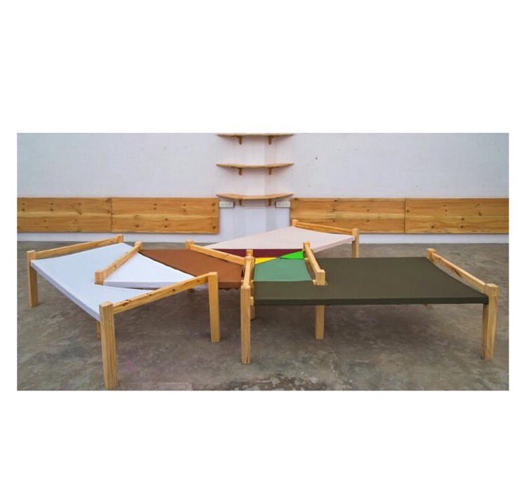
CHAI DIAGRAM : INSTALLATION BY SANKET AVLANI
Curator & Art Director Sanket Avlani was inspired by our gourmandise Chai Musk and, in particular, by its structure of ingredients. Using this as a starting board, he created the Chai Diagram.
Highlighted by its invigorating palette, the Chai Diagram features an overlay of ‘charpois’ or traditional Indian benches, symbolic of the various layers of the perfume.

CANDY LAB : EDIBLE INSTALLATION BY POOJA DHINGRA
Gastronomic artist Pooja Dhingra is known for her experimentations. For our Sensorium, Dhingra was inspired by her favourite 1020.


UNTITLED : PHOTOGRAPHY BY COLSTON JULIAN
Photographer Colston Julian is known for his unapologetic photography, especially those of the spirit of Bombay. For us, he was inspired by the mysterious Moire.
Inspired by the concept of synchronicity through diversity, Julian’s photograph of the Bombay skyline through mist is both hazy yet familiar. We know those buildings, we know those paths but through Julian’s lens, the lines become blurry and merge into one another – creating something new altogether.


BLACK BOX SYNTHESIZER : AUDIO/VISUAL INSTALLATION BY SANDUNES + JIVER
For our launch, Sandunes + Jiver teamed up to create the fantastic Black Box Synthesizer. An audio/visual installation, the Synthesizer aimed to compare the accords in perfume and music.
A highly subjective installation, the experience varied for everyone, depending on what keys they chose to push.

THE OLFACTORY : A WORKSHOP BY BOMBAY PERFUMERY X LOVER
Blue Tokai Bombay played background to our very first workshop curated by LOVER.

We invited members of Mumbai’s creative community – from interior designers to stylists to graphic designers and even a food critic to join us over a cup of coffee as we explored the world of progressive perfumery.
Part one saw our founder Manan Gandhi introducing the fragrances, talking about their journeys and ingredients.

With the participants jumping in with their opinions on the fragrances, the conversations revolved around the origin and quality of ingredients to the way perfume is actually created.
After a quick break, our lab for the interactive perfume-making class was set up. Flasks of essential oils, natural and synthetic components and droppers dominated the tableau. With Manan breaking down the core of every perfume to its composition of top, heart and base notes, the participants got around to concocting their own perfume.


DEVELOP A NOSE FOR STORYTELLING : A WRITING WORKSHOP BY MICHAEL BURNS
Apart from creating intriguing fragrances, Bombay Perfumery truly believes in participating in and fostering the burgeoning creative community. Perfume and, by extension, the sense of smell creates a fantastic platform to develop stories from.
We tied up with Michael Burns, founder of Tall Tales, to develop a unique workshop at the G5A Foundation for Contemporary Culture where one’s nose literally leads one to the story.
Crafted as a hands-on writing workshop, Michael first introduced our participants to the different senses. Moving on to introducing our fragrances, he encouraged them to engage with the fragrances and jot down words and memories that they associated with our 8 perfumes.

Using those memories and descriptions, the participants came up with a distinctive character and environment, creating the perfect background to develop a story.


NOTES : SHWETA MALHOTRA
Notes is our latest series on exploring the dynamics of creativity over an informal break. We chatted with some of the most eminent as well as some of the upcoming artists in India today. Today, we talk to graphic designer Shweta Malhotra about her journey & inspirations.
Could you tell us a little about your journey towards design?
After graduating in Applied Arts from Sophia Polytechnic (Bombay) in 2004, I started out as an Art Director with advertising agencies like McCann Erickson, Contract Advertising and Ogilvy. In Feb 2008, after a short stint at Fabrica (Benetton’s Visual Arts Research Centre in Italy), I decided to pursue a career in Graphic Design and have since worked with firms like Grandmother India and Rediffusion Y&R Design.
I currently work as an independent graphic designer/graphic artist with a keen interest in design for lifestyle, music and fashion.
I don’t think I can pin point one piece of work really, but currently I’d say – Carmen Herrera’a Exhibit – ‘Lines of Sight’ which is currently on display at the Whitney Museum, New York.

Green & Orange by Carmen Herrera. Image by Chi Lam.
You’re known for your iconic deconstruction of popular looks – could you offer us a sneak peek into your thought process when you set out to design them?
My overall style of work is very minimal, geometric, bold and graphic. I try to strip down a visual/element off details to its most basic form, yet maintaining its essence.

Seascape inspired by Varkala – Shweta Malhotra
The fashion illustrations came out of my love for fashion and graphic design, I started picking my favourite looks and illustrating them in a similar style.

What are your favourite accounts on Instagram?
Again too many, but here are a few –
What does your playlist look like?
It’s mostly a lot of R&B/Hip hop, Electronic, Disco.
What was your inspiration for your piece Seven Islands for our Sensorium?
The inspiration for the Seven Islands Artwork was the Bombay seascape and its horizon along with the fruity marine and floral hints of the fragrance. All of this coming together in a dreamlike image.

NOTES : ASHIESH SHAH
Notes is our latest series on exploring the dynamics of creativity over an informal break. We chatted with some of the most eminent as well as some of the upcoming artists in India today. Our second edition is with Ashiesh Shah, renowned architect and art collector.
1. Could you tell us a little about your journey towards design.
I was always fascinated by architecture and design and painting was just something I did since before I can remember, I think it started there. When I was studying dentistry, I realized quite early on that it wasn’t something I felt passionately about. It didn’t allow the kind of free thinking and creativity like in fields like architecture and design. I needed to be creating something, and architecture seemed like the right choice. With time I became more interested in design based practices.
Interiors by Ashiesh Shah. Images via Ashiesh Shah on Instagram.

Interiors by Ashiesh Shah. Image via Elle Decor India on Instagram.
2. What’s the one piece of design that’s imprinted itself in your mind?
There’s a lot of different things I find inspiring, art, architecture, design, literature and nature. My work doesn’t make direct references to any particular place, designer, architect or artist but they become important elements in my creative process. I think some of Le Corbusier’s work is pure genius, with respect to both material and form. I’m also influenced by modern movements like the Bauhaus.

Governer’s Palace, Chandigarh by Le Corbusier. Image via Alexander Gorlin Architects

Bauhaus Chair by Marcel Breuer. Image via Red List.
3. What’s on your reading list?
Geometry of Design: Studies in Proportion and Composition by Kimberly Elam
History of Modern Design by David Raizman) and Design as Art by Bruno Munari
4. In your capacity as an art collector, could you recommend some young artists to keep an eye on?
Collecting art is not just for the super wealthy, it’s definitely not about how much you spend; its all about what you spend it on. Starting a collection often seems like a daunting activity, where does one begin? It might come as surprise, but the truth is that anyone can collect and buy art intelligently, even without an art expert showing them around. All you need is a love and appreciation of fine art and design and a few simple techniques to help evaluate the work you’re interested in. Stay true to your taste, buy work that you appreciate regardless of what the current rage may be. Learn what you like. Start by looking at a lot of art, follow gallery programs, visit museums and try to attend open studio events where artists talk about their work. There’s a lot of young artists worth looking at Sahej Rahal, Prajakta Potnis, Ayesha Sultana.

Sahej Rahal. Image via KHOJ.

Prajakta Potnis. Image via ArtSlant.
5. Could you let us into your thought process for creating the Arcus for our Sensorium?
Characterised by a vocabulary of clean lines and geometric forms, Arcus appears minimal but is full of subtle details. Created using brass and the perfume bottle itself, it appears almost sculptural- with an added material play, the opaque brass and the translucent liquid perfume. The arch of the stand is a central element in my architectural practice and reappears in my body of work. Drawing inspiration from mid century masters like Le Corbusier and Etorre Sottsass, I feel like the stand exudes an almost vintage meets contemporary feel.

Arcus by Ashiesh Shah.

NOTES : NIKHIL D
Notes is our latest series on exploring the dynamics of creativity over an informal break where we chat with some of the most eminent as well as some of the upcoming artists in India today. Our next edition is with stylist Nikhil D. In his years of work, he’s constantly pushed the boundaries of conventionality.
Could you tell us a little about your journey towards design.
When I didn’t get into the art school I applied at, my back up was design school. After finishing school, I worked at an Indian brand for a year as a designer before I started styling. None of these things were planned and just happened by chance until I started loving what I did and worked at Marie Claire India as Style Editor for 3 years. Now as a fashion consultant I get to do everything I’m good at – style, design and create which was the main goal.
What’s been your favourite shoot – across your work or anybody else’s?
This shoot I did with 9 Indian girls as the faces defining beauty of the new and changing India. All of their parents hailed from two different states within the country. The pan-Indian beauty did not come from the south if she was dark skinned or have high cheek bones if she was from the western ghats. We shot them all on Polaroid with Prasad Naik in natural light and barely any makeup.

What does your moodboard look like?
My moodboards are usually collages of photographs or art that I do keeping colours, the personality of the person we are creating and his or her mindset as a visual. I usually have images of objects and old photographs on these and like to layer them to look like one single image.
As someone who has been part of India’s changing style climate, in your opinion, who are the young designers who spearhead the new Indian look of Western contemporary flair & Indian craft and technique?
I have always felt close towards Kallol Datta’s work. He challenged ideas of what women think looks good on them and preconceived notions about what is flattering to her body. I like that it does not scream it is Indian but has so much to do with where he is from. I also like Akaaro, Sanjay Garg, Bodice, Eka, Lovebirds, Runaway Bicycle – I think they all in their own way are reinterpreting the changing Indian look with or without Indian crafts.

Kallol Datta 1955 photographed by Errikos Andreou for Elle India
 Lovebirds AW 16 photographed by Hormis A.
Which historical figure would you have liked to styled and why?
David Bowie even though he would never need it.
Everyone on Bold and the beautiful cause it was my granny’s favourite show and my first idea of the fashion world. Also now that I think about it they needed it.
Cover Image : Styled by Nikhil D, photographed by Niko Mitrunen for Marie Claire India.

NOTES : DEBORAH DI FIORE
Notes is our latest series on exploring the dynamics of creativity over an informal break. We chatted with some of the most eminent as well as some of the upcoming artists in India today. We caught up with Deborah di Fiore of Modest Genius Design to talk about her journey and inspirations.
Your visual language is quite distinctive. Could you tell us about your journey towards it?
There are some important moments in my life that are decisive – like my first Art Book, when I was eleven years old. It was a beautiful book on Picasso and I got obsessed, something that continues till this day. Secondly, when I started studying at the Ecole Nationale des Arts Decoratif de Paris, for 5 years, I explored different disciplines and techniques, before graduating in graphic design.

The Acrobat & Girl With A Mirror by Picasso. Image Source.
In my bag, there’s always a sketchbook. These days, I’m using this ink brush pen to draw on craft paper. I usually sketch whatever is around me, mostly people. It is an exercise I have to practice everyday.

While working, I listen to music, all sorts of music… and some podcast about science, history or philosophy…
Your design is often rooted in your surroundings – what’s your thought process as you design – for instance, your series on Islamic architecture?
I think one of the reasons I create images is in a way to question the reality we live in, so it is all about observing, absorbing and transforming what is around us…
Last January, I went travelling to Delhi and I was sketching using the red colour that I associate with the city.
I started a series of Monghol architecture drawings. From the sketches, I wanted to make something more graphic and modern, so I used stripes.
“Twisted Tradition” could be the name of this Islamic Architecture series. It is a subject I would like to explore : the relation we have with our cultural heritage, and what we do with it – where tradition meets modernity.

At the same time, I was reading a lot about Daniel Buren. I love the work he has done in public places in particular. Usually using stripes, his visuals attract your attention to a certain place. I found it very interesting how he makes us look at our environment in a different way.

The series of architectural drawings will be exhibited in Marie Helene de Taillac’s boutique windows and Isetan in Tokyo in February 2017.
What are your favourite art spaces around the world?
Let’s start with Paris where I was born and raised. It is amazing what the city can offer in terms of culture.
Then the Venice Art Biennale is the best art experience I’ve ever had. The full city is a place to explore with hidden art installations.
And Sue Kaoukji’s office in Kuwait. Sue Kaoukji, in addition to being my best friend’s mom and my inspiration, is the curator of The Al-Sabah Collection. The collection regroups some precious objects from the Mughal era and is travelling the world. I had the chance to see some of the objects when I visited Sue in her office. Opening drawers and cupboards full of treasures was a magical experience, like Ali Baba’s cave was opened to me! The Treasure of Humanity is kept so well here, with so much respect, it is very impressive and touching.

Tell us a little about your travels from Paris to Bombay.
Ho that was completely unexpected!
I was very bored in Paris after I graduated. So as soon I would make a bit of money, I would buy a flight ticket and run away!
It is almost 12 years ago that I flew to India. I had found a job in Rajasthan; a French lady was opening an art gallery and artist residency in a beautiful haveli in Shekhawati. I went to work for her for sometime.. India was so different from my culture, it was fascinating and funny! I was happy.
After the exhibition project got over, I went to Jaipur to meet the famous French jewellery designer Marie Helene de Taillac. I started to work with her – I was responsible for her jewellery production and was also designing for the new Hot Pink concept store. Working closely with the best artisans in Jaipur was a magical experience.
Then it was time to start my own project, so I started Modest Genius Design, working on art direction, graphic design and illustration.
If you only had one colour left to design with, which one would you choose & why?
Blue is my colour, because it feels so good!

NOTES : AYESHA KAPADIA
Notes is our latest series on exploring the dynamics of creativity over an informal break. We chatted with some of the most eminent as well as some of the upcoming artists in India today. We caught up with art director Ayesha Kapadia of Komet Juice for a quick behind-the-scenes.
Tell us a little about your journey.
I have been drawing and making things for as long as I can remember. Art and making things is second nature to me. It’s the only thing I’ve known how to do. It’s the only way I know how to be. Throughout my childhood, I hated school. It was traumatic. And the only thing that made it tolerable was art, dramatics/theatre and science projects. Then Art School happened and I was introduced to the world of Typography and Bauhaus and Andy Warhol and it all just felt like home.
Right after graduating I worked as an Art Director at an advertising agency but it wasn’t for me. So I quit and did an Art Residency at Space118 where I explored and discovered what I was capable of creating. Then I went on to working with two social enterprises that stand for craft and women empowerment – Chindi and Okhai, as a Designer. I had also started getting commissioned for illustration jobs. Somewhere in the middle of all of this I found myself married to Instagram. It’s a beautifully simple medium committed to visuals and I began using it as a medium of expression started making short films as a medium of self-expression and preservation of memories. I was committed to ticking things off a list I had made as a little girl, to make and do things I had always wanted to do. I’m still ticking things off that list.

Ayesha for Chindi
You work with different mediums to create interesting narratives. How do you go about selecting the direction of any given project?
Each project comes with its own personality and the challenge is to be able to empathise and translate that personality with the understanding of visual aesthetics that I come with.
You’ve been collaborating with musicians since a while now, whether its visual language or art direction. What’s your thought process while transferring one form of creativity to another?
To be able to translate the energies of sound into a visual format is all about expression for me. It’s not much of a thought process and has more to do with being a sponge. What I mean by that, and what I thoroughly enjoy about the process, is absorbing all the emotions that come with the sound and vomit it out as art or graphic design or even a film. For the artwork I designed for Nicholson’s first EP, Sorabh and Rohan were nice enough to let me sit in the studio with them during the making of the EP, absorbing sounds and then translating it into art.

Art Direction for Parekh & Singh’s I Love You Baby, I Love You Doll
What does your moodboard look like?
Definitely has pictures of Andy Warhol and Edie Sedgwick / Glitter / A variety of different textiles: I love cloth! / Glitter / Fashion / Glitter / Polaroids / Images of the Galaxy / Architecture / Glitter

Birth of Venus 316 by Andy Warhol. Source.
You’ve created these lovely Bombay Noir videos for us. Please share your thoughts, inspirations and ideas that led to the short films.
Oddly enough, I make memories through fragrances/smells. I remember events and people and faces and things through smells. Fragrances have always been a huge trigger for certain memories for me. And so when I was commissioned to making these films, I found it very interesting to put this oddity to use. Each fragrance from your wonderful collection triggered a certain kind of feeling and I tried to express those feelings through the medium of moving images.
What are your favourite places in Bombay?
Well, all the classic British architecture, the beauty that is the building structure of the Bombay Arts Society, Matterden Cinema, the High Court at night with the hallway lights on, inside a rickshaw with a quirky colour palette on the seats and hood, my pani-puri wallah, any and all terraces, there are so many more.
The Bombay Art Society. Source.
But most of all, my most favourite place in Bombay is my nani’s house. I’ve spent most of my formative years in that 100 year old building with the red clay hexagon tiled flooring and washed out teal walls that hold hand painted portraits of my great grandmother and great grandfather. I’ve stared at their faces for hours and hours wondering what they might have been thinking while they got their portraits painted. Because unlike a photograph, a painted portrait gets made over days through various emotions. And I couldn’t help but wonder about the bits of their thoughts or emotions that have been frozen in time. The delicate crystal chandelier was always an object of mystery that partook in all my imaginary games that I played in that house. It’s almost like I befriended these objects and over the years they have seen me grow and have been part of the journey. My silent confederates. They know all my secrets. They have seen all my awkward times and still stand by me now. You know how as human beings we tend to form relationships with objects? And also because of the kind of people that make that house a home.
Top Instagram accounts to follow.
What’s on your playlist?
Mo Kenney – Telephones
Parekh & Singh
I’m in love – Noonie Bao
Cold Water – Nicholson
Lykke Li – Until We Bleed
Penguin Cafe Orchestra – Perpetuum Mobile
Prateek Kuhad
Glass Animals
Adele
Tchaikovsky
Horse Powar – Queen
Gold Panda – You
